There are different types of charts in Excel that are used to simplify data analysis and visualization. Depending on the version of Microsoft Excel you are using, when you create charts, you can choose based on usage.
Microsoft Excel has columns, lines, pie, doughnut, bar, area, scatter, and more charts to choose from. Excel 2016 included other charts types including treemap, sunburst, histogram, box and whisker, and waterfall.
Each type of chart in Excel is specifically used to analyze a particular series of data. The type of data series suitable for line charts may not be suitable for pie charts. For example, waterfall charts are suitable for analyzing data variances while area charts are suitable for cumulative data series.
In this tutorial, we shall discuss the different types of charts in Excel and their uses. We’ll also use chart examples to illustrate a particular chart type. For detail on how to make charts in Excel, visit our previous article here.
Types of Charts in Excel
To effectively use charts in Excel, you need to understand different data series suitable for each type of chart. In this section, we shall discuss the types of charts in Excel and the data suitable for each chart.
Column charts in Excel
These types of charts use vertical bars to represent data in Excel. In this type of chart, categories are plotted on the x-axis and values on the y-axis. There are 3 types of column charts: simple, clustered and stacked column charts. Each of these types of charts has 2-D and 3-D versions.
Simple column charts
Use this type of chart to compare values across a few categories of data. For example, the table below shows the quarterly sales record across 4 regions. To compare the total sales for each region, we use a simple column chart.
| Region | Qtr 1 | Qtr 2 | Qtr 3 | Qtr 4 | Total |
| North | 2,358,600.00 | 3,251,400.00 | 2,546,320.00 | 4,532,500.00 | 12,688,820.00 |
| South | 2,948,250.00 | 4,064,250.00 | 3,182,900.00 | 5,665,625.00 | 15,861,025.00 |
| East | 3,243,075.00 | 4,470,675.00 | 3,501,190.00 | 6,232,187.50 | 17,447,127.50 |
| West | 3,361,005.00 | 4,633,245.00 | 3,628,506.00 | 6,458,812.50 | 18,081,568.50 |
| Total | 11,910,930.00 | 16,419,570.00 | 12,858,916.00 | 22,889,125.00 |
You can also use this kind of data to make pie charts since it represents the category and the values.
Clustered column charts
This type of chart is used to compare values across categories. For example, the table above shows the quarterly sales record across four regions. To compare sales of each region per quarter or sales per quarter by region, we use clustered column charts.
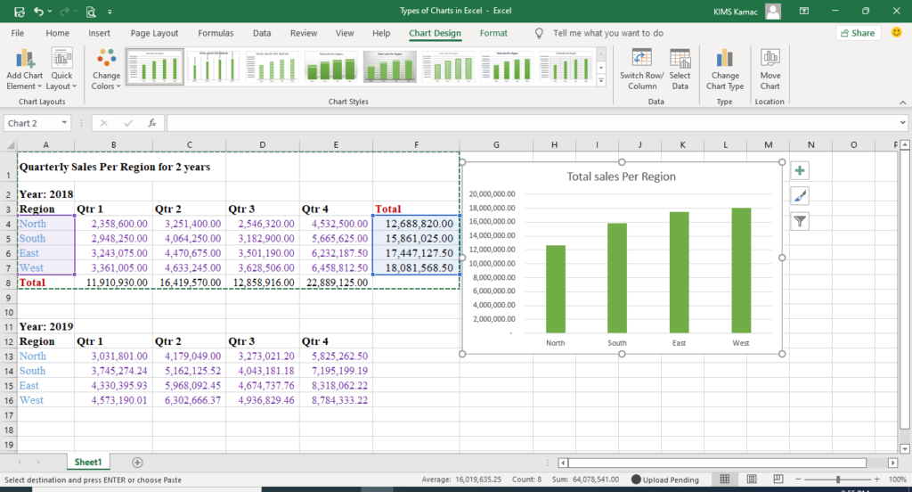
The chart will show the variations in sales for each region per quarter. Sales reps in each region can easily understand when to anticipate higher sales every year and prepare ahead of time.
Stacked column charts
This type of chart is used to specify parts of an entire category. When the emphasis on data is the total value, but you want to know the components, use stacked. For example, if our emphasis on the above sales data is on the quarterly sales. Then, to still understand the contribution of each region we use stacked instead of the clustered chart.
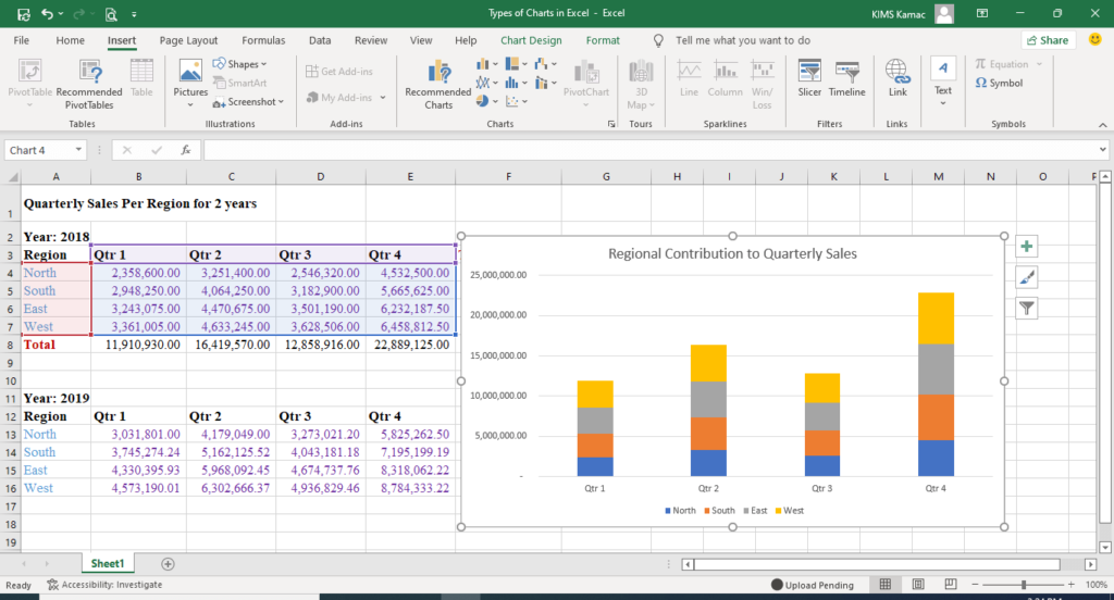
There are two types of stacked column charts: the normal stacked and the 100% stacked. The 100% stacked is used when the emphasis is on the percentage contribution of each component. You can also use it to understand how each component of the entire category changes over time.
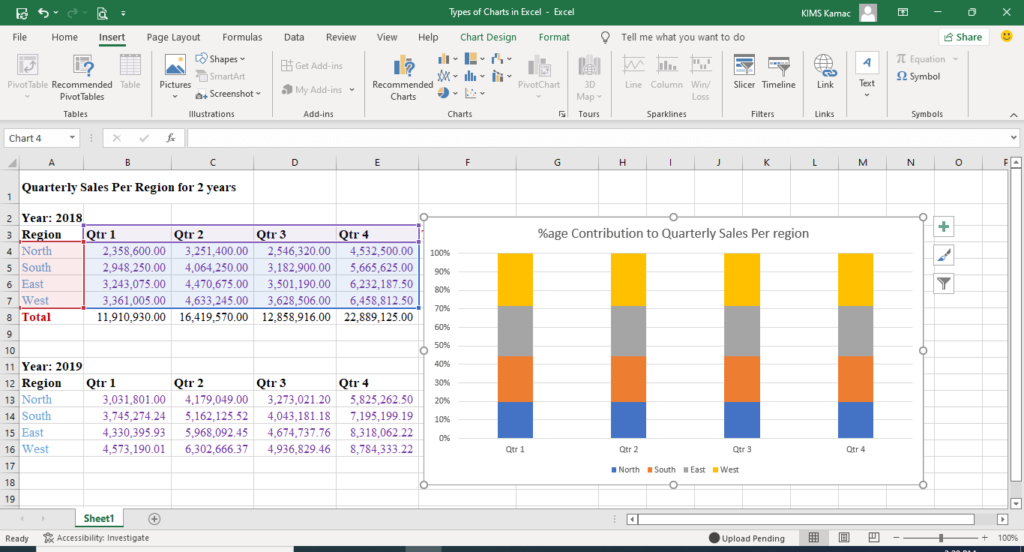
The above stacked column chart shows the percentage contribution of each region to the quarterly sales. Notice that data are plotted against percentages instead of actual values.
NOTE: You can also use the 3-D version of each of the graph types.
Bar charts in Excel
Bar charts use horizontal bars to represent data in Excel. Everything obtainable in column charts is also obtainable in bar charts. You can use them interchangeably.
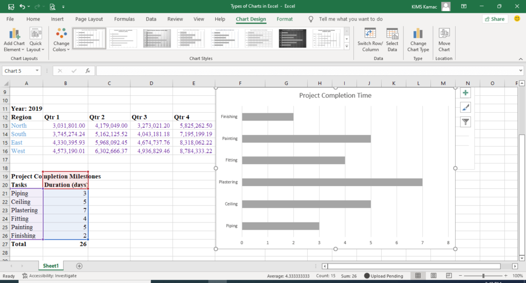
The difference is that bar charts organize categories in the y (vertical)-axis and values in the x (horizontal)-axis. The key reason to use bar charts is when category names are long or when values represented are in durations. A typical example is shown in the figure below.
Line charts in Excel
This type of chart uses lines and lines with markers to represent data in Excel. In this type of chart, categories are plotted evenly on the x-axis and values on the y-axis.
We use line charts to display data with a continuous flow such as trend data represented in years, months, etc. There are 3 types of line charts: the normal, stacked and 100% stacked line charts.
You can use each of the line charts with a marker or without a marker. Line charts also have a 3-D version. Line charts are useful when the order of data categories is important.
Normal line charts
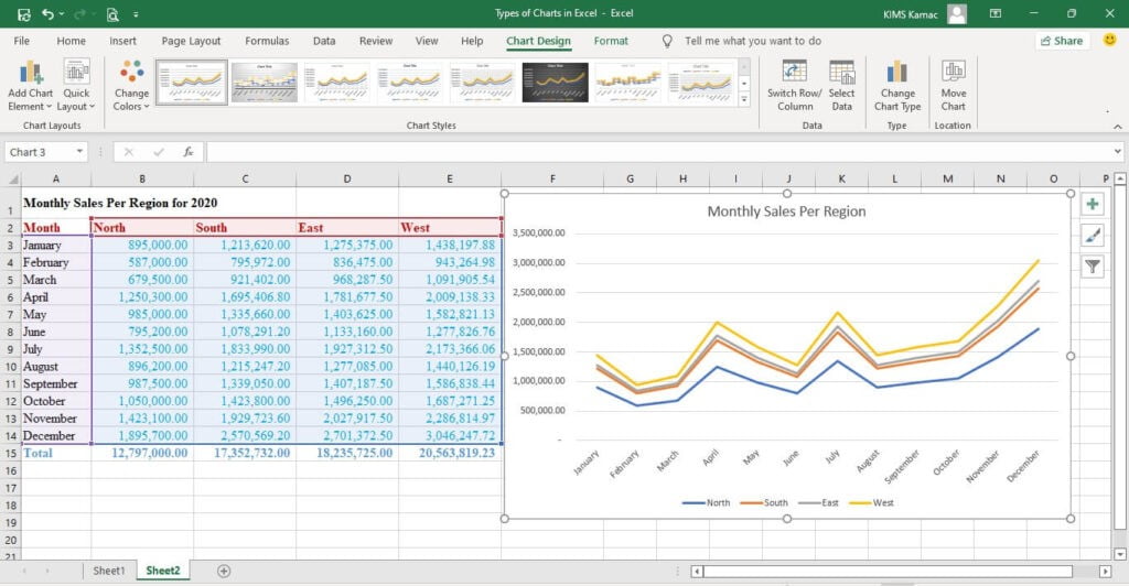
Use this type of chart to display trend values over time. You can use a line chart with or without a marker. Line charts with a marker are useful when there are few data points. When there are many data points, it is advisable to use line charts without a marker.
When there is a single category, one line chart is displayed. When there is more than one category, each category is represented with a line chart.
For example, the table below shows the Monthly sales record across 4 regions. The line chart represents the sales of the four regions.
| Month | North | South | East | West | Total |
| January | 895,000.00 | 1,213,620.00 | 1,275,375.00 | 1,438,197.88 | 4,822,192.88 |
| February | 587,000.00 | 795,972.00 | 836,475.00 | 943,264.98 | 3,162,711.98 |
| March | 679,500.00 | 921,402.00 | 968,287.50 | 1,091,905.54 | 3,661,095.04 |
| April | 1,250,300.00 | 1,695,406.80 | 1,781,677.50 | 2,009,138.33 | 6,736,522.63 |
| May | 985,000.00 | 1,335,660.00 | 1,403,625.00 | 1,582,821.13 | 5,307,106.13 |
| June | 795,200.00 | 1,078,291.20 | 1,133,160.00 | 1,277,826.76 | 4,284,477.96 |
| July | 1,352,500.00 | 1,833,990.00 | 1,927,312.50 | 2,173,366.06 | 7,287,168.56 |
| August | 896,200.00 | 1,215,247.20 | 1,277,085.00 | 1,440,126.19 | 4,828,658.39 |
| September | 987,500.00 | 1,339,050.00 | 1,407,187.50 | 1,586,838.44 | 5,320,575.94 |
| October | 1,050,000.00 | 1,423,800.00 | 1,496,250.00 | 1,687,271.25 | 5,657,321.25 |
| November | 1,423,100.00 | 1,929,723.60 | 2,027,917.50 | 2,286,814.97 | 7,667,556.07 |
| December | 1,895,700.00 | 2,570,569.20 | 2,701,372.50 | 3,046,247.72 | 10,213,889.42 |
| Total | 12,797,000.00 | 17,352,732.00 | 18,235,725.00 | 20,563,819.23 |
Stacked line charts
This type of chart is used to show how the components of a category contribute to the entire value. This type of line chart is difficult to read, it is better to use the stacked column charts.
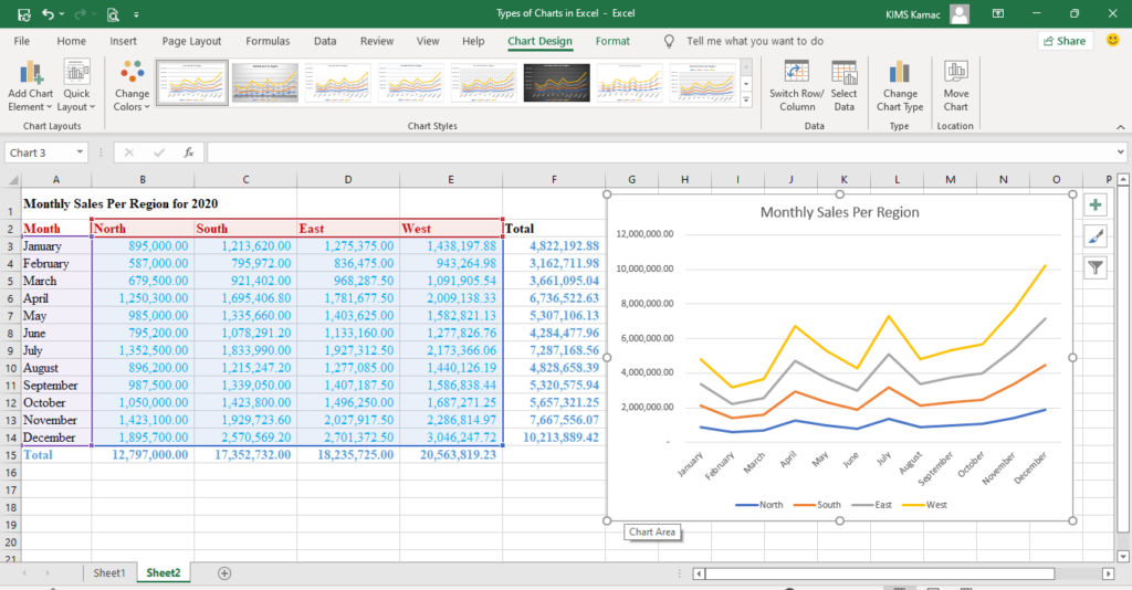
Looking at the above chart, you will discover that it is difficult to understand the contribution of each region.
100% stacked line charts
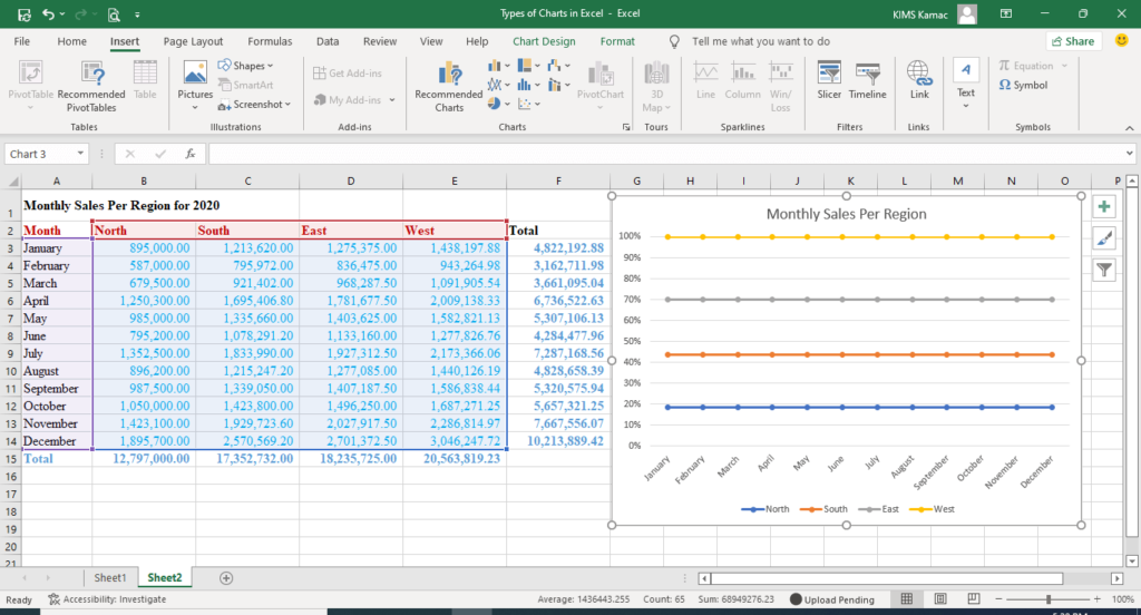
The 100% stacked is used when the emphasis is on the percentage contribution of each component. You can also use it to understand how each component of the entire category changes over time. Also, 100% stacked column charts are preferred to this type of line chart.
Pie charts in Excel
Pie charts are used to show the proportion of each category in a data series. It divides the whole data and shows the proportion of each on a 100% scale.
Pie charts are used when there is only one data series. For example, to display the above data in a pie chart, we use only the total sales per month. Also, pie charts cannot be used when the data value is negative or zero.
In Microsoft Excel, you can use 2-D or 3-D pie charts or the pie of pie charts. Using the above data, the pie chart for monthly sales is given below. (We used the months and the monthly totals).
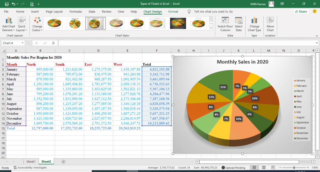
Pie charts should not be used when there are too many data categories (see above chart). Seven (7) is the ideal maximum data category if you want to use pie charts.
Doughnut charts
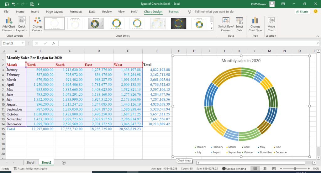
This type of chart is like a pie chart. It is used to show the proportional contribution of a category to the whole data. Doughnut charts show data in rings with a complete ring totaling 100%.
We use doughnut charts rather than pie charts when there are more than one data series. Each data series is represented in a ring with each ring totaling 100%.
Using the data table above, we can show the percentage contribution of each region in four rings as follow.
Area charts in Excel
Line charts show trend data points but area charts are used to display the cumulative data series. Area charts can display the change over time or the sum of the plotted values in a trend. For example, we can plot the cumulative sales by each region. This will help us see the actual contribution or weight of each region to sales.
There are 3 types of area charts: the area chart, stacked, and 100% area charts. Each of these charts has a 3-D version.
The area charts
This type of chart can be used to display the trend of values over time. It can be used to highlight the magnitude of change. However, a line chart is preferred to this type of chart. Also, a stacked area chart is preferable. This is because one data series can cover the data of the other series. See the example below.
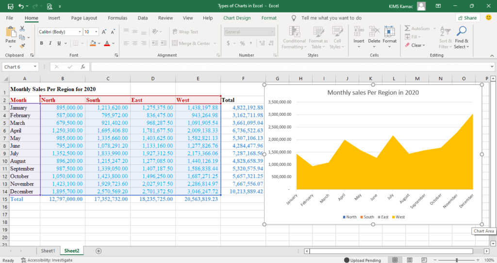
The data series of the West region covers the other regions making it impossible to see their contribution.
Stacked area charts
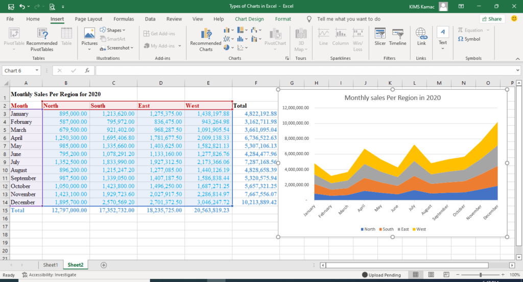
Stacked is used to show the contribution of each series to the entire data. It is used when attention is on the total value, while the series represents the magnitude of change. A typical example using the above data is shown below.
100% stacked area chart
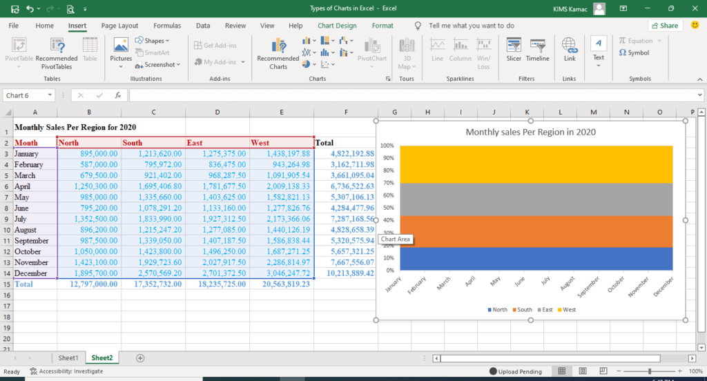
This type is used to show the percentage contribution of each series to the entire data. An example based on the above data is shown below.
XY scatter charts
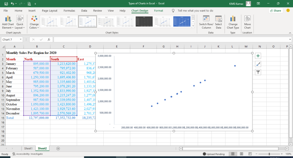
A scatter chart is used to plot data on the x and y-axis. Data usually represent independent values obtained from observation, scientific, or engineering experiments.
The scatter graph is used for showing the distribution of data points. It draws inference of the relationship between the x and y data points. In regression analysis, it is used to draw a line of best fit.
You can use scatter charts when there are many data points. Also, when you want to show the similarities between two large sets of data.
There are 3 types of scatter charts namely:
- Scatter charts – this type is used to plot the relationship between two data sets (x and y). It does not have any connecting lines.
- Scatter charts with smooth lines – this type connects the data points with a smooth line. The line can be a curve based on a formula or a straight line. You can use a marker if there are few data points or without a marker if there are many data points.
- Scatter charts with straight lines – This chart shows scatter plots with a line of best fit. The straight line shows the relationship between the x and y data sets.
Using the above monthly sales data, we shall plot a scatter chart to show the relationship between North and south sales.
Bubble charts in Excel
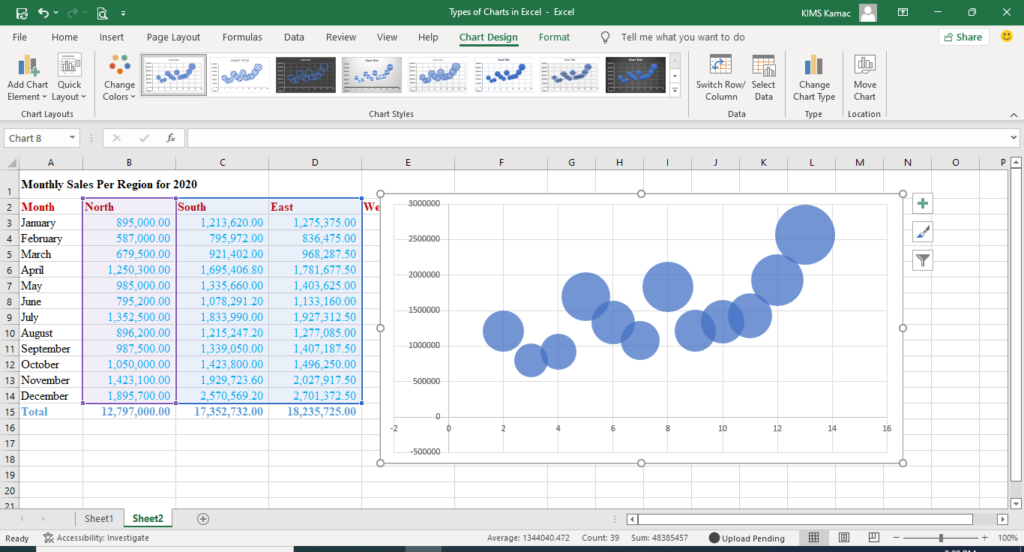
Bubble charts are like scatter charts. It has 2-D and 3-D versions. Bubble charts are used to represent the relationships between data sets. However, it uses three values rather than two to represent data points. The third value is used to represent the size of the data point.
Typical data to be used for bubble charts will have X, Y, and Z values, with Z representing the size of the bubble. For example, plotting north, south, and east regions sales data on a bubble chart will result in the following.
Stock charts
Stock charts are used to display data that has inherent fluctuations. For example, stock prices, exchange rates, temperature, and rainfall data. It can be used to show the trend of stock values over time. It can also show the trend of data values that fluctuates over time.
To use this type of chart, values must be arranged in their proper order. For example, an open-high-low-close chart must display data for the four data points accordingly.
There are four types of stock data, namely: high-low-close, open-high-low-close, volume-high-low-close, and volume-open-high-low-close.
High-low-close stock charts
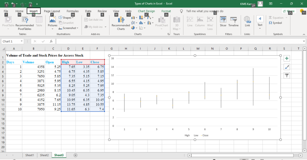
This type of chart represents 3 data series in this order: high, low, and close. Three columns are created to show each series but in that order. For example, the table below shows the volume and prices traded for Access stock in the last 10 days.
| Days | Volume | Open | High | Low | Close |
| 1 | 4358 | 5.25 | 7.65 | 3.35 | 4.25 |
| 2 | 3251 | 4.75 | 6.75 | 4.35 | 5.85 |
| 3 | 7650 | 6 | 7.35 | 5.15 | 7.15 |
| 4 | 3871 | 5.95 | 6.55 | 4.15 | 4.95 |
| 5 | 5025 | 5.35 | 8.25 | 5.25 | 7.95 |
| 6 | 2980 | 8.15 | 10.45 | 6.35 | 6.95 |
| 7 | 6235 | 6.2 | 9.05 | 4.3 | 7.35 |
| 8 | 4152 | 7.65 | 10.95 | 6.35 | 10.45 |
| 9 | 3875 | 11.15 | 13.75 | 4.85 | 10.55 |
| 10 | 7950 | 9.25 | 11.65 | 6.3 | 7.4 |
The high-low-close chart will use the 3 series to create the chart as follow.
Open-high-low-close charts
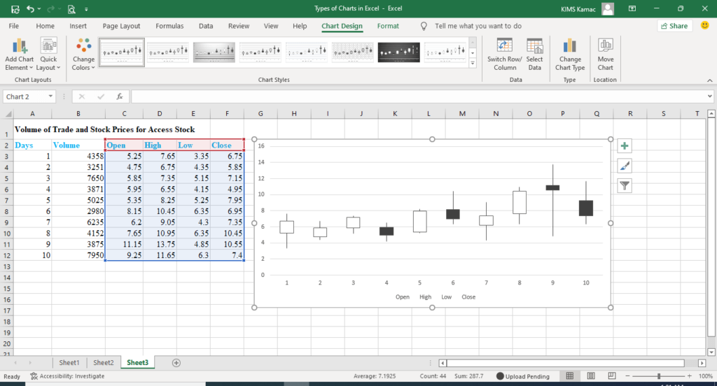
This chart type uses four series of values to display price fluctuations in the following order: open, high, low, and close. It displays data series in a candlestick as shown below using Access stock prices.
Volume-high-low-close
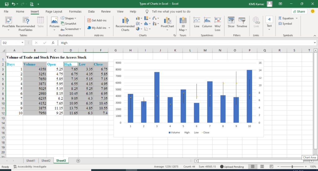
This type of chart uses two axes to measure volume and prices. Volume is displayed in rectangular bars and prices within the volume bars. A typical example using stock prices above is shown below.
Volume-open-high-low-close
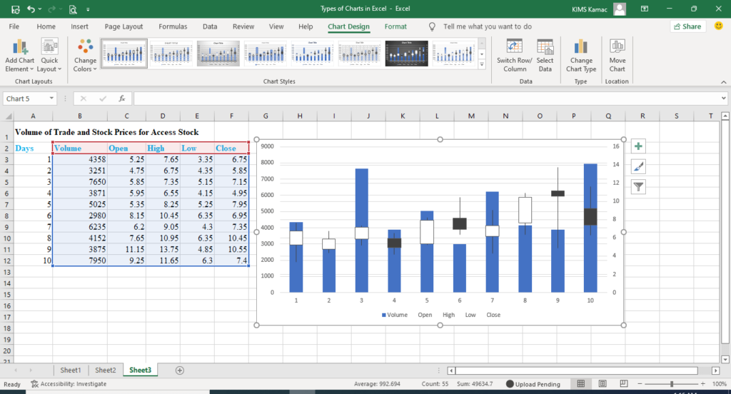
This type of chart uses rectangular bars and candlesticks within the bars to represent volume and price fluctuations. The five series must be represented in this order: volume, open, high, low, and close as shown in the diagram below.
Surface charts
Surface charts are used to display the relationships between two sets of data. It is mostly used when the emphasis is on the optimum combination of the two data sets.
Surface charts use contours and colors to indicate areas within the data sets. Areas with the same range of values are indicated with the same colors as shown in the example below.
There are four types of surface charts:
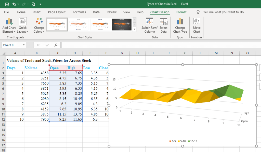
- 3-D surface charts – are used to show the relationships between two sets of data. It uses colors to differentiate between a range of values. The same color is used to show values that fall in the same range. Using the open and high stock values above, we can create a 3-d surface chart thus:
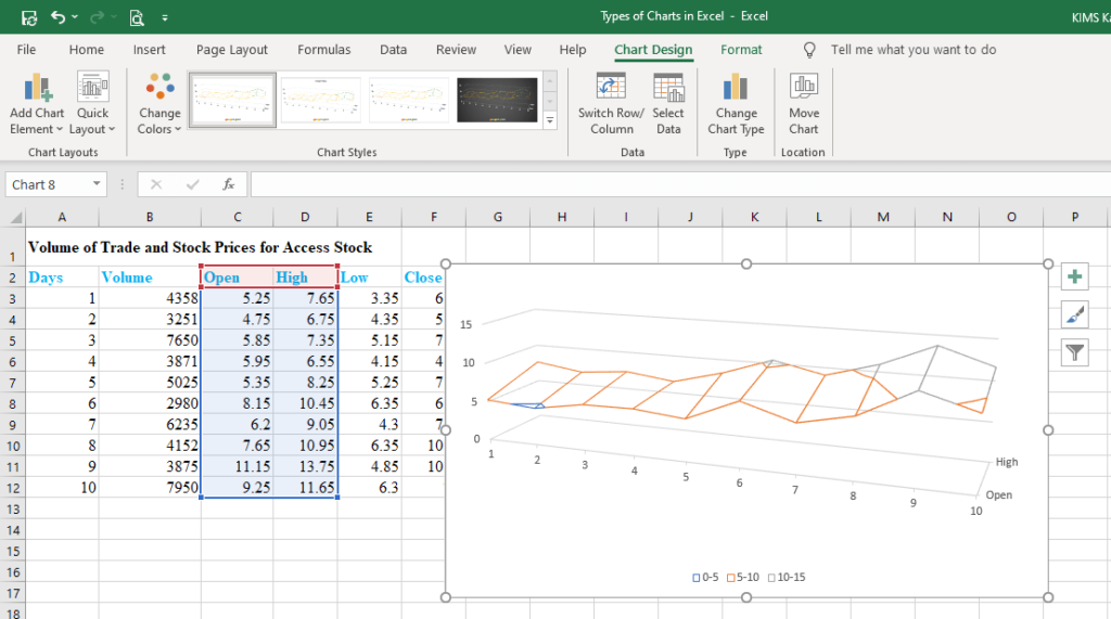
- Wireframe 3-D surface charts – this type of chart is similar to the 3-d surface chart but does not show colors. It uses only lines to plot data sets. An example using open and high values is shown below.
- Contour charts – are like 2-D topographic maps used to connect interpolated points that have the same value. Colors are used to represent a similar range of values.
- Wireframe contour charts – are contour charts that use only lines. They can be difficult to read and understand.
Radar charts
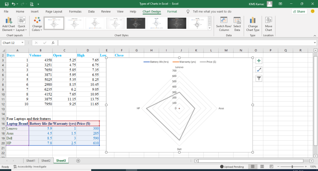
A radar chart can be used to compare the aggregate values of multiple data series. It is used to compare several data series with reference to the center point. This can be useful when data categories are not directly comparable. For example, the table below shows the price, battery life, and warranty of four different laptop brands. We can use a radar or spider chart to compare the features.
| Laptop Brand | Battery life (hrs) | Warranty (yrs) | Price ($) |
| Lenovo | 5.9 | 1 | 300 |
| Asus | 4.5 | 1.5 | 285 |
| Dell | 8.5 | 3 | 590 |
| HP | 7.8 | 2.5 | 610 |
There are two types of spider charts: radar charts (and with markers), and filled radar charts.
Plotting the above data in a radar chart we have the following.
Treemap charts
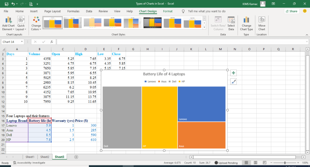
Treemap chart was introduced in Excel 2016. This type of chart shows the hierarchical view of data categories. Different colors are used to show different categories. The size of a rectangle shows the proportion of a category from the whole. It can be used to compare many categories of data in a hierarchical view.
Using the laptop data above we can plot a treemap to show the battery life of the brands. Notice that the size of each rectangle depends on the proportion of the whole.
Waterfall Charts
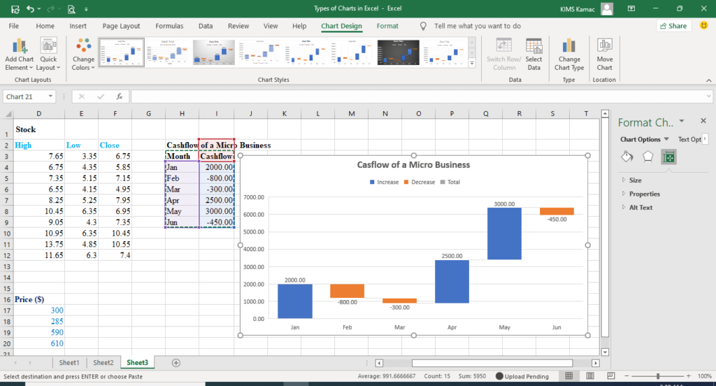
Waterfall charts were introduced in Excel 2016. It is used to explain the changes that occur in financial data. It shows how financial data changes over time in relation to the original figure.
When there are a series of additions and subtractions from the original figures, the changes are captured with a waterfall chart. The chart can use color codes to show where additions and subtractions occurred.
For example, the table below shows the cash flow of a micro business for six months. The waterfall chart shows when there are additions and subtractions.
| Month | Cashflow |
| Jan | 2000.00 |
| Feb | -800.00 |
| Mar | -300.00 |
| Apr | 2500.00 |
| May | 3000.00 |
| Jun | -450.00 |
Histogram charts
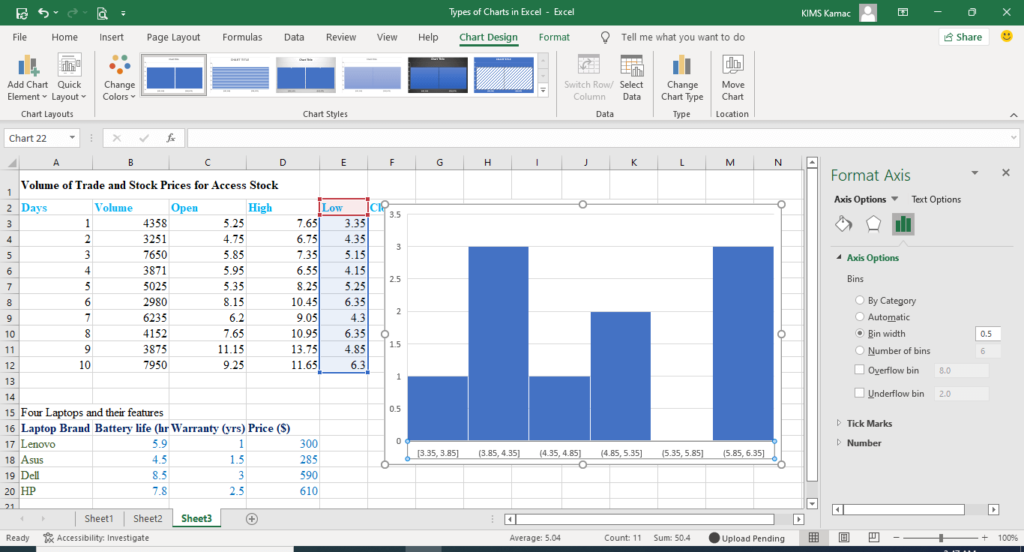
Histogram charts were introduced in Excel 2016 and are useful for displaying the frequency distribution of datasets.
With a histogram, we can plot the percentage or number of occurrences (frequencies) of different data categories. Histogram enables you to group data categories into frequency bins.
There are two types of histogram charts: histogram and Pareto charts. The Pareto chart is used to plot the cumulative percentage contribution of each category to the total. Data is sorted in descending order when used.
For example, let us create a histogram chart for the low values in our Access stock data. I grouped the frequency bins in an interval of 0.5 to replicate 6 bins (see below). You can reduce the bin width if you wish (see how to edit charts).
Conclusion
All the types of charts in Excel are useful for purposeful data analysis as we have seen. From this discussion, you would have understood that it is not enough to know how to create graphs in Excel. It is equally important to know the uses of the different types of graphs in Excel/
Understanding the types of charts in Excel and their uses will enable you to create informative charts. We believe that this article has helped you understand the types of charts in Excel and how to use them. If you are new to creating charts in Excel, visit and learn how to create charts in Excel. We are open to your questions and contributions.


