CSS layout deals with the arrangement of HTML elements in a webpage or website. Here we will learn how to position the contents of our HTML outside its normal flow. Particularly, we are going to discuss table CSS layout and multiple CSS layout.
The Default Flow
When we write our HTML code, elements are by default stacked on each other in a normal flow. Let us illustrate this with the HTML code below.
From the output above it is obvious that block elements are stacked according to the order of the code.
However, CSS layout will help us to understand how we can deviate from this flow and impose the layout we want. This will help us create a better and more beautiful appearance of our site.
To impose our desired CSS layout, we will need to manipulate the CSS code using any of the following methods:
- Display property: We have discussed three classes of the display properties including block, inline and inline-block. Other display properties values that can be used to change our sites layout include flexbox CSS layout, grid CSS layout, and table CSS layout. We shall discuss each of them shortly.
- Floats: Another property that will help us alter the normal flow of our site layout is the float We can use the values of this property to decide which side we can position an element in our site.
- Position property: This property is also important when placing elements on a website. With the position property, we can choose where to locate and how an element should behave in the site CSS layout.
- Multi-column: Finally, we can also use the multi-column property to layout elements in columns depending on what we want to achieve.
We will walk through each of these properties. Let’s start with the table CSS layout.
Building CSS Layout with HTML Tables
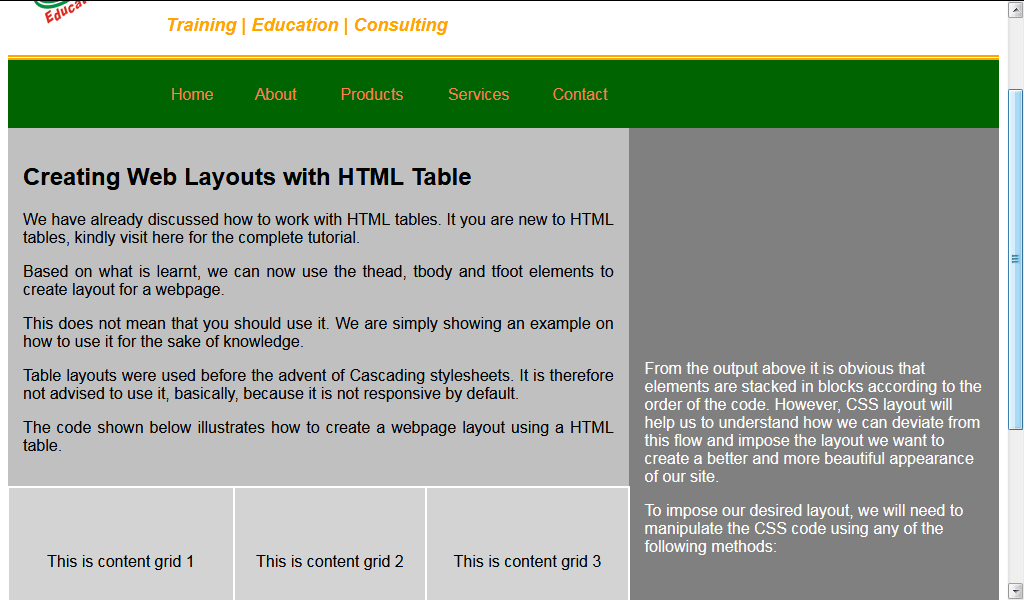
The table is an old method of laying out a webpage. Table CSS layouts were used before the advent of Cascading stylesheets. It is therefore not advised to use it, basically, because it is not responsive by default.
Using a table, we can position elements at specific points in the table row. But this method is no longer favored in modern web designing.
We have already discussed how to work with HTML tables. If you are new to HTML tables, kindly visit here for the complete tutorial.
Based on what is learnt, we can now use the <thead>, <tbody> and <tfoot> elements to create layout for a webpage.
This does not mean that you should use it. We are simply showing an example of how to use it for the sake of knowledge.
The code shown below illustrates how to create a webpage layout using a HTML table.
Multiple Columns CSS Layout
Here, we shall discuss how to layout our contents in more than one column. The multiple column features allow you to divide your webpage contents into more than one column. This feature mimics what is popularly seen in newspapers and magazines.
Creating columns
To create multiple column content, we use any of the following properties: column-count, or column-width.
column-count: The column-count property is used to specify the exact number of columns you want for your page contents. It takes on a unitless value of 0, 1, 2, … When the column-count property is used, the browser itself will work out the gaps between the columns.
Let’s illustrate using our last HTML example. Simply add the following CSS to the section: margin: 0 auto; column-count: 4;
The whole CSS and HTML should be:
column-width: We use the column-width property when we want a particular width for our columns. However, if the container could not accurately utilize the width, the remaining width will be shared among the columns. This means that the actual width size may be larger than the specified width size. The column-width property takes on a length value (px, in, cm, em, etc).
Let us now change our CSS above to the following:
NB: Notice that using column-width makes your webpage mobile friendly than using column-count property.
Customizing columns
The columns we created above defaults to the browser’s style. Let us now discuss some properties that will help us style the columns we have created. This is necessary if we do not want the columns to default to browser’s style.
Some of the properties we might set to our columns are Column-gap, Column-rule, Column-fill, and Column–span.
column-gap: This is used to set a gap between columns. The value can be a length of px, em, cm, etc.
column-rule: This property is used to add vertical lines between the columns. It works like the border property. It is used as a shorthand for the column-rule-width column-rule-style and column-rule-color.
It takes on the same values as the border property. E.g. column-rule: 3px solid red;
The column-rule-style can take on any of the following values: dotted, solid, double, dashed, inset, groove, outset, ridge and none.
The column-rule-width takes on length values while the column-rule-color takes on color values.
NB: Column-rule-width should be less than or equal to column-gap.
Let us illustrate:
column-fill: This property is used to specify how the contents of your column is filled. Its values include:
- balance (default value, here contents are equally filled),
- auto (here columns are filled sequentially. The later columns may not be fully filled).
column-span: This property is used to indicate the number of columns an element should cover. It can take on any of these values:
- none, and
- all.
To illustrate the above properties, let us add the following CSS to our HTML above.
NB: All browsers do not support column-span property. We used the Chrome browser.


