To make pie charts in Excel is simple, just as to make other types of charts. Pie charts represent data categories in proportions, though it is not suitable for all kinds of data.
In Microsoft Excel and other spreadsheet applications, charts help us to summarize data. A well-created chart or graph helps data consumers to analyze trends, spikes, and data patterns at a glance.
Sometimes, data could be cumbersome and difficult to analyze, but with charts, you can easily visualize the trends and patterns. Available charts in Excel will allow you to represent data in a variety of ways. You can choose between column, line, pie, bar, and many more charts suitable for your data.
Making professional-looking charts in Excel and other spreadsheet applications is easy. All you need to do is to choose a chart type, a chart layout, and a chart style.
For example, to make pie charts in Excel, you start by entering the data for the chart on a worksheet. Then select the data and choose a pie chart from the Charts group on the Insert tab. The chart appears as shown in the figure below.
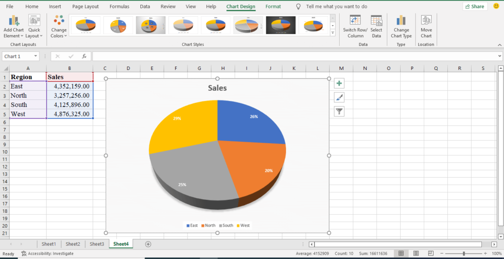
Excel supports numerous types of charts to help you display data in ways that are meaningful to you and your audience. In this tutorial, you will learn how to make charts in excel, including pie, bar, and line charts.
Types of Charts in Excel
Microsoft Excel 2016 has about 15 types of charts you can choose from. The type of chart you can choose to represent your data depends on the nature of your data. Let us list the different types of charts in Excel 2016 and the nature of the data suitable for them.
| S/n | Types of Charts in Excel 2016 | Use Case |
| 1 | Column charts (vertical bars) | Use to compare values across different categories |
| 2 | Bar charts (Horizontal bars) | Use to compare values across different categories, especially, when categories name is long |
| 3 | Line charts | Use to display trend values over time, especially, when there are many data points |
| 4 | Area charts | Use to display trend values, especially, when there is a need to highlight the magnitude of change over time. |
| 5 | Pie charts | Use to show the proportion of a category from the whole. The whole equals 100%, each proportion is derived from the 100%. |
| 6 | Treemap charts | Use to compare values arranged hierarchically using different rectangular levels, especially, when there are few categories |
| 7 | Sunburst charts | Use to compare values arranged hierarchically using a ring, especially when there are many categories of data |
| 8 | Histogram charts | Use to display the distribution of data |
| 9 | Box and whisker | Use to display the variations within data categories |
| 10 | Scatter charts | Use to show the relationship between two sets of data |
| 11 | Waterfall charts | Use for financial data to show the cumulative effect of a series of positive and negative values |
| 12 | Surface charts | Use to show trend values across two dimensions |
| 13 | Radar charts | Use to show values relative to a center point |
| 14 | Stock charts | Use to display the trend of stocks or forex over time, especially when there are different price values |
| 15 | Combo charts | Used to combine two charts for two different values to highlight different types of information |
How to make charts in Excel
Charts or graphs are graphical representations of data. Charts are used to summarize large tabular data for easy understanding. It also shows the relationship between the different parts of the data.
In Microsoft Excel, there is a Recommended Charts command; this command helps a user to choose the appropriate chart for the data in the view.
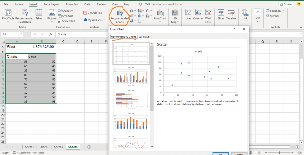
To create charts in Excel, do the following:
- Select the range of data you want to create chart on.
- Select the Insert tab.
- On the Insert tab, under Charts group, select Recommended Charts or choose any chart type of your choice.

- The selected chart is automatically plotted and displayed for you, based on the selected data.
How to make Pie Charts in Excel
Pie charts are circular graphs used to represent numerical proportions of data in slices. Pie charts represent proportions of categorized data in percentages.
To make pie charts in Excel, your data should be categorized. For example, the geographical distribution of sales, gender distribution of students, departmental distribution of salaries, etc.
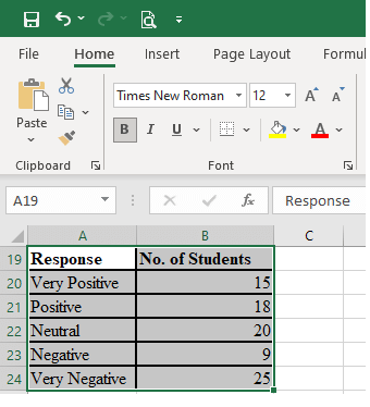
To illustrate how to make pie charts in excel, let’s use the following table. The table shows the level of students’ responses in a Chemistry class of 87 students. Let us make pie charts using the data.
| Response | No. of Students |
| Very Positive | 15 |
| Positive | 18 |
| Neutral | 20 |
| Negative | 9 |
| Very Negative | 25 |
To make pie charts in Excel, do the following:
- Enter the above data in a worksheet. You can also copy and paste the data in a worksheet.
- Select the range of data, as shown below.
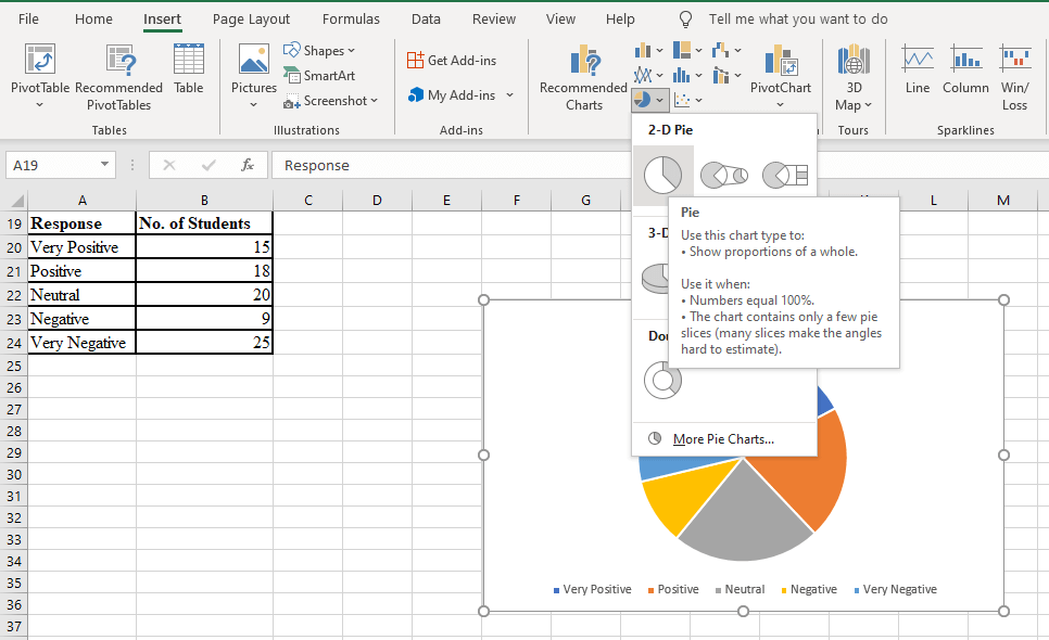
- On the Insert tab, under Charts group, select the Pie Chart icon.
- From the list, choose any of 2-D Pie, 3-D Pie or Doughnut. Your chart is displayed as shown below.
- Select the chart title, delete the current title and replace it with an appropriate chart title.
- You can also change the chart style from the Chart Design tab to a suitable style.
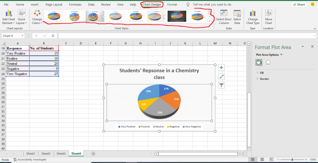
- Perform other editing tasks as explained under editing and formatting charts.
How to make Bar Charts in Excel
Bar charts in Excel use vertical or horizontal rectangular bars of different heights to represent categorized data. The lengths of the rectangular bars are proportional to the values they represent.
Microsoft Excel differentiates between column charts and bar charts. Column charts use vertical rectangular bars to represent data, while bar charts use horizontal rectangular bars. Both can be used for the same kind of data. Bar charts are usually recommended if the category titles are long.
To make bar charts in Excel, do the following:
- Enter the appropriate data in a worksheet.
- Select the range of data you want to use to plot a bar chart.
- On the Insert tab, under Charts group, select the bar Chart icon. NB: You can also select Recommended Charts to display the list of charts suitable for the selected data. Select either column or bar chart from the list.
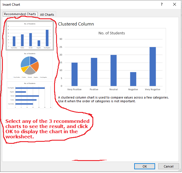
- If you selected the bar charts icon, from the list, choose any of 2-D column, 3-D column or 2-D bar or 3-D bar. Your chart is displayed.
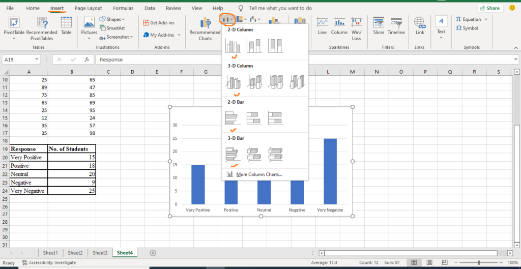
- Select the chart title, delete the current title and replace it with an appropriate chart title.
- You can also change the chart style from the Chart Design tab to a suitable style.
- Perform other editing tasks as explained under editing and formatting charts.
How to make line charts in Excel
Line charts in Excel are a series of data points that are connected together with a straight line. Line graphs are suitable for trend values. They represent data points over time, e.g., years, months, or days.
To make line charts in Excel, do the following:
- Enter the data in a worksheet.
- Select the range of data you want to use to create line charts.
- On the Insert tab, under Charts group, select the line Chart icon. NB: You can also select Recommended Charts to display the list of charts suitable for the selected data. Select a chart from the list and click OK.
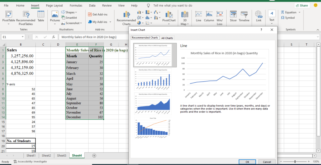
- From the dropdown list of line charts icon, choose any of 2-D line, 3-D line or area chart. Your chart is displayed as shown below.
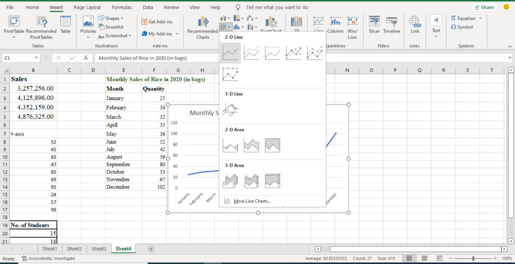
- You can change the chart style from the from the Chart Design tab to a suitable style.
- Perform other editing tasks as explained under editing and formatting charts.
Editing and formatting Charts
When you make charts in Excel, two more tabs are added to the list of tabs in MS Excel. These tabs are Chart Design and Format tabs. NB: The chart must be selected in order to display these two tabs.

- The commands on the Chart Design tab are used to edit the look of the created chart automatically.
- The commands on the Format tab are used to edit the individual texts, lines and shapes of the chart.
How to Edit charts in Excel
To edit charts in Excel, do the following:
- Select the chart to display the chart editing tools, see image below.
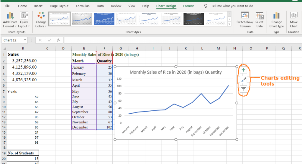
- Click the “plus-like” icon to display the Chart Elements list. The items on the list depends on the type of chart selected.
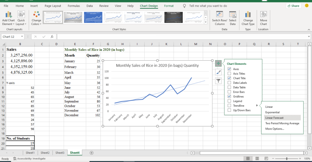
- Select any of the items on the list to display the element on the chart. e.g., select the Chart Title to display a title for your chart.
- To edit a displayed element, click to select it, then type a suitable text in the selected box.
- Click on the arrow at the right of the selected item to display the item’s properties. e.g., you can place the Legend at any of Top, Bottom, Left or Right positions.
- Click the “brush-like” icon to display the Style and Color properties of the chart.
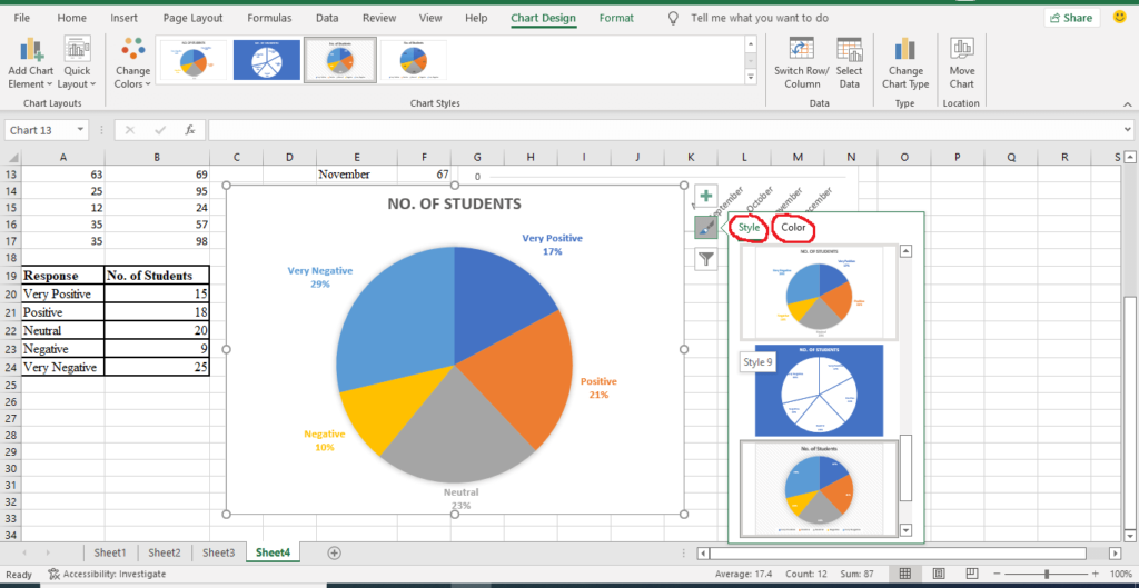
- Under the Style tab, select a style of your choice to see your chart’s properties change.
- Under Color tab, select a color scheme of your choice to see the chart’s colour scheme change.
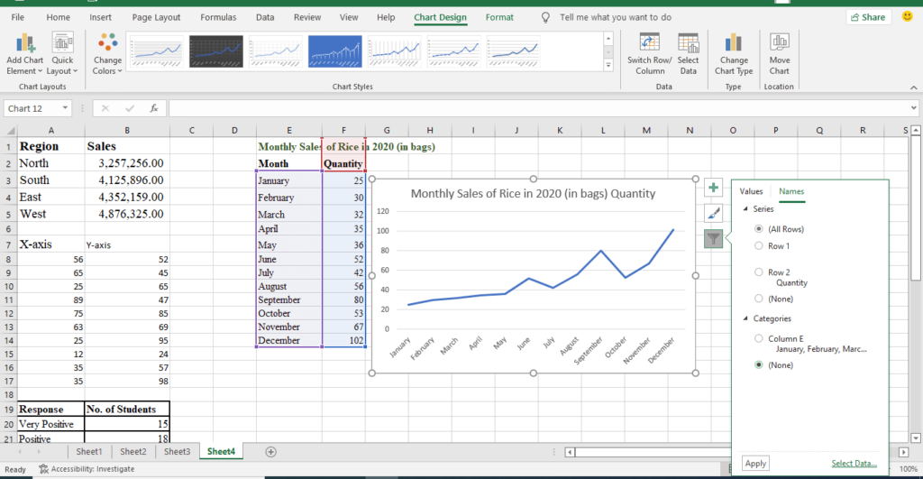
- Click the “funnel-like” icon to display the Values and Names properties of the chart.
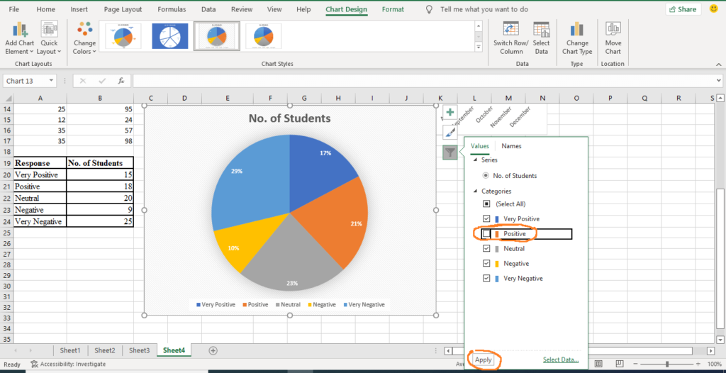
- The Values tab is split into Series and Categories. To remove or add any item on the Series and Categories, deselect or select such item and click Apply on the down-left corner of the list.
- For example, to remove positive category on the pie chart above, deselect the positive option button and click Apply.
- Therefore, you can decide to show or not show the values of the categories or series on your chart.
- Finally, you can use the Names tab to display the titles used on your data table on the chart or not. E.g. If you do not want to display the names on the categories list, select (None) and click Apply.
Change the location of a chart in a workbook
- Click the chart to select it and to display the chart design tab.
- On the Chart Design tab, in the Location group, click Move Chart.
- From the dialog box that appears, under Choose where you want the chart to be placed, do one of the following:
- To display the chart in a chart sheet, click New sheet.
- To display the chart as an embedded chart in a worksheet, click Object in, and then click a worksheet in the Object in box.
Save charts in Excel as a chart template
- Right-click the chart that you want to save as a template.
- From the popup list that appears, select Save as Template.
- In the Save in dialog box, make sure that the Charts folder is selected.
- In the File name box, type an appropriate name for the chart template and save.
- To create a new chart based on the graphs template, do the following:
- Select the range of data.
- On the Insert tab, under Charts group, select Recommended Charts.
- On the Recommended Charts dialog window, select the All Charts tab.
- From the list of chart types, select Templates folder.
- Select the charts template you want to use to create your chart and click OK.
Conclusion
Charts are data analysis tools that help us to summarize, visualize and compare data with ease. Microsoft Excel provides different types of charts that are suitable for different categories of data.
To make charts in excel is easy and straight forward as explained in the sections above. Though we did not illustrate how to create all types of graphs in Excel, the steps are the same. No matter the type of chart you want to create, follow the steps on how to make charts in Excel.
We also added here how you can customize your charts using chart editing tools. The tools explained are handy when you use them through the ribbons command. The Chart Design tab makes it easy to edit charts in Excel. I believe that this tutorial has helped you to learn how to make bar, line, and pie charts in Excel. If you have questions, please, kindly forward them.


